
 (October 2007) In any one day, homeland security and law enforcement agencies might sift through thousands of complex and often contradictory clues about potential terrorist threats. These clues can be buried in a landslide of raw text, recorded messages, surveillance data, and bank records that would fill millions of iPods each day.
But most of these clues are “fuzzy”: The same face (or is it?) appears in three surveillance clips, or someone is snapping up makeshift detonators on the Web. If fuzzy clues follow a pattern, the pattern must be inferred. To thwart another September 11, analysts must meld the encyclopedic eye of Google-age technology with Sherlock Holmes’s inductive genius.
Late last century, Edward Tufte catalogued ways to display data that were either structured (train schedules) or similar (death rates). Today, researchers at the Department of Homeland Security's (DHS) Science and Technology Directorate (S&T) are creating ways to see fuzzy data as a 3-dimensional picture where threat clues can jump out. The field of visual analytics “takes Tufte’s work to the next generation,” says Dr. Joseph Kielman, Basic Research Lead for the Directorate’s Command, Control and Interoperability Division. Kielman advises the National Visualization and Analytics Center, based at Pacific Northwest National Laboratory, and its university partners, called the regional centers.
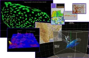
The centers’ interdisciplinary researchers are automating how analysts recognize and rate potential threats. Mathematicians, logicians, and linguists make the collective universe of data assume a meaningful shape. They assign brightness, color, texture, and size to billions of known and apparent facts, and they create rules to integrate these values so threats stand out. For example, a day’s cache of video, cell phone calls, photos, bank records, chat rooms, and intercepted emails may take shape as a blue-gray cloud (picture, lower-right). If terror is afoot in L.A. and Boston, those cities are highlighted on a U.S. map (picture, center).
A month of static views might be animated as a “temporal” movie, where a swelling ridge reveals a growing threat. Analysts can then state, “I think a bomb will explode here.”
“We’re not looking for ‘meaning,’ per se,” Kielman explains, “but for patterns that will let us detect the expected and discover the unexpected.” Neither the researchers nor the analysts, he says, need to understand the terrorists’ language—no small advantage, given the shortage of cleared linguists.
It will be years before visual analytics can automatically puzzle out clues from fuzzy data like video, cautions Kielman: “The pre-9/11 chatter didn’t say, ‘We’re going to plow airplanes into the Twin Towers.’ To correlate these facts, you must get relational,” connecting screen names with bank records, bank records with faces. How researchers will get there remains an unwritten story. But with each chapter, the plot thickens.
To request more information about this story, please e-mail st.snapshots@hq.dhs.gov.